I've always felt most comfortable in the realm of dark fantasy.
The book is now available in France and can also be ordered from the publisher (Actusf) here: Skin Trade Book

I thought I'd dig into my files and share some of the process for this cover.
Rough Sketch:
Here's my initial rough sketch and idea... I ended up just going with the first sketch. The idea was to draw a very shadowy killer in front of a mirror that was framed with bones. The mirror was a bit shattered and had the image of a wolf. This wasn't to be any scene from the book, but more catch the mood and themes. I also drew this cover at a smaller size than some of my cover-type drawings. It was printed smaller, so I needed to limit myself.

Wolf Skull Study:
A rough sketch/study of a wolf skull that I pulled from my sketchbook. This was actually an element that I had not used on another project and thought it would fit in the composition for this one.

WIP Pencil photo:
As in many of my drawings, I didn't use photo ref on the main character. I still study anatomy and how the shadows fall on a character, though I'm not going for a perfect photo real look. I look for interesting shapes and designs in a composition and try to catch the character's emotion and a mood to a scene. Those things are most important to me.

Pencil Version:
Here's the pencil stage. I left some areas rough, to be detailed out in ink.

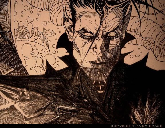
Ink Version:
At first the background was going to be more black and in complete shadow. I decided to add some more twisted shapes and mystery back there, to give it a more creepy look. I wanted to keep with simple shapes in back though, so the detailed characters would stand out better.

Color Version:
My idea with the color on this one, was to just add a some minimal spot color in a stylized way. I think this sort of coloring works well, when the figures already stand strong in B&W ink. It also added to the horror feel on this book.


*note- to see larger: right click pic "Open link in new window"
ReplyDeleteYou are quite good!
ReplyDelete